Clear calls to action
July 21, 2017 · Chris Peters
After redesigning a couple websites recently, I’ve run across a common mistake that I see frequently: missing calls to action on key pages.
After redesigning a couple websites recently, I’ve run across a common mistake that I see frequently: missing calls to action on key pages.
If you’re new to digital marketing parlance, a call to action is a bit of text or even a group of elements designed to guide the user into taking a desired action. Sometimes it can be as simple as a button with an action (Sign up! Buy now!) or a set of instructions (Sign up, call one of these numbers, or email us). It can be anything, really, as long as it helps the visitor understand what to do next if they’re interested. Don’t leaving them hanging.
Many pages end up being published with no call to action. These pages may contain a description—maybe even a great one—and that’s it. This is a dead end. Without making it clear what to do next, you’re basically leaving money on the table because you can’t rely on everyone to figure it out on their own.
At the end of the day, we’re all lazy sloth people that need a little bit of help from time to time. Or is that just me?
All of this sounds simple, right? It is. But yet…
How we ended up with no calls to action
In both redesign projects, I think that there was one culprit. It’s pretty common for an organization to hire a web design agency (or even an in-house designer) that creates a “shell” design for the website: the general layout, navigation, fancy home page, etc. Then it’s up to the client to fill in the content. And then the designer exits swiftly.
The web agency usually follows a process like this one:
- Create pretty design mockups in Sketch or Photoshop for a few key pages.
- Set up a content management system (CMS) with the mocked up pages all set up.
- Provide a bit of functional training on using the CMS, with little or no instruction on content strategy or best practices for web content.
- Say, “Have at it, client! Fill in the rest of the pages! Figure it out yourselves! See you at the next redesign!”
- Send the invoice.
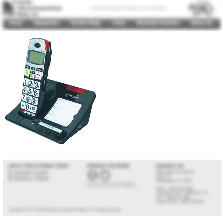
On the old version of one of the sites that I redesigned, here’s an example of a page that you landed on if you clicked one of the product photos. (I kid you not.)

(Blurred to protect the poor client’s identity.)
It didn’t even have the title of the product or anything. What if a user somehow landed here, and this was the first page that they saw? Back button city!
How to create better calls to action
There are two main types of pages:
- Navigational
- Helps the user decide which page to go to next. These are hub pages that lead to the destinations. Example: A page that lists product categories. This type of page doesn’t need any call to action. Its job is to help the user decide on a category to drill into.
- Destination
- Teaches the visitor something, entertains the visitor, and/or persuades the visitor to take an action. Example: a product page.
Destination pages should include at least one call to action.
Any time you’re authoring a destination page, ask the question, “What action do I want for the visitor to take?” Don’t publish the page before adding a link, button, or block of text that encourages this action.
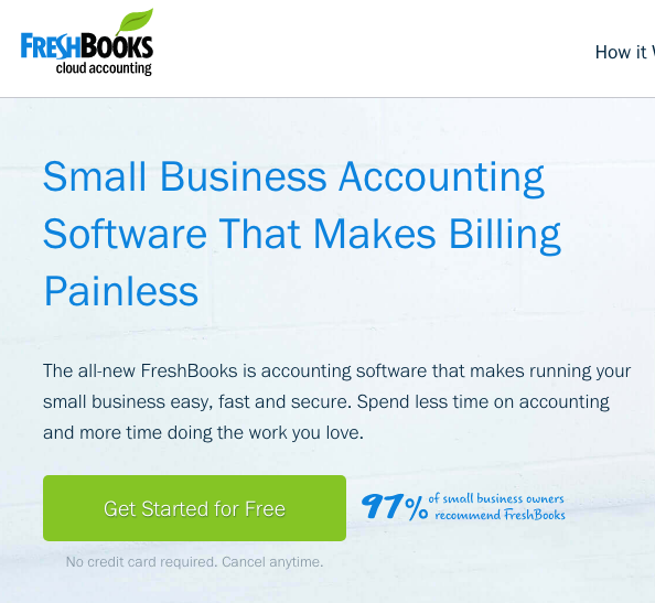
Let’s gaze in admiration at an example call to action from FreshBooks:

You know what to do next, right? And you may even want to do it.
Lead up to the CTA
Even though we’re talking about calls to action, it’s important to think about all of the content that appears on the page before that. This content should climax just before the call to action. Its job is to instruct, educate, entertain, and/or persuade. Once the visitor arrives at the call to action, they should have been persuaded by all of the preceding content.
I often see posts and articles that blame the call to action itself for poor conversion rates:
- You need a call to action. (Hey, that’s this post.)
- Your button needs to be bigger.
- Try a link instead of a button.
- Put the lead form directly on the page.
Yes, play around with all of that. Measure and compare results. Use what works best. If your page has no call to action, then add one.
But at some point, you may need to blame the content that comes before it if you’re observing lackluster business results. Are you offering the right information? Does your page or video take too long to load? Are you really speaking to your intended audience in language that resonates with them?
Get calling
Perhaps you’re exclaiming, “I totally have hundreds of pages without calls to action!”
If so, here’s my call to action: call your audience to action in your web content and emails. If you have a lot to improve upon (don’t we all?), start on your site’s key pages. Then improve from there.